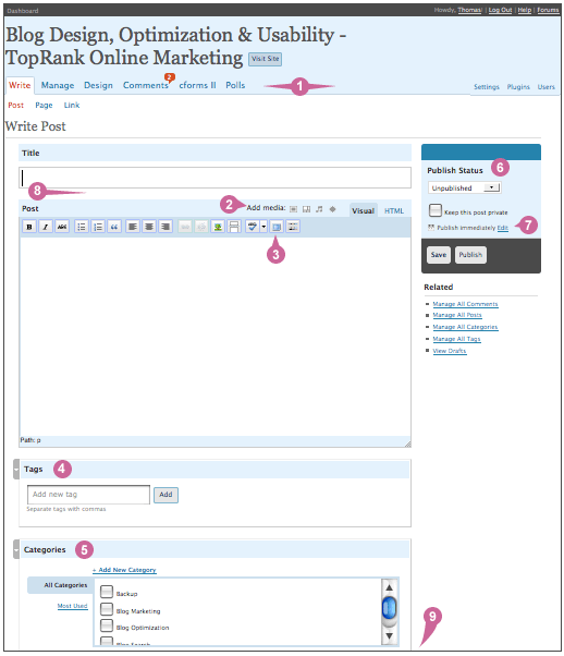
Overall new look and feel for the post screen. Cleaner, more colorful and simplified. Everything is still there, but the layout is different. Getting use to it may take a minute or two, but you’ll end up loving it.
Here are a few of the modifications made to the post screen. Under the image is a listing that describes each number call out.

- New menu layout. Main menu options are bigger and on the left. Secondary options smaller and on the right. They are all still there though.
- The post window is basically the same, however they did add in a media bar. The media bar lets you post audio, video, images and other sorts of media. The image uploading is now up here too which makes it much more convenient. This is a great addition for all content publishers.
- There is also a new ‘Fullscreen‘ button that allows you to maximize your post writing area to use your whole browser window. I’m currently in love with this feature.
- Tags are still below the post and now get add one at a time instead of in a comma separated list.
- The categories have been moved quite a ways down under the post. Not sure why, but I guess the idea is you work your way down the main column.
- Publish status is now a nice drop down menu. You don’t have to change it to publish though, just hit the publish button. The ‘Publish and Continue Editing’ button is gone now. Since it auto saves, that functionality is not needed. Plus, the save button brings you back to the post which is nice.
- The timestamp is also under ‘Publish Status’. By default it’s set to publish immediately. Or you can hit the ‘Edit’ button to change the day and/or time. This is much upgraded for the checkbox functionality in earlier releases. I know quite a few people who’d change the time and not check the box. This is much nicer.
- Post Slug is now cleverly hidden away until needed. Put in a post title and it’ll show up right under the title box. This shows a direct correlation to what is entered into the title box. If you want to edit it, juts click on it and it’s editable. Hopefully this will help users avoid long and ugly URLs.
- Additional ‘advanced‘ options such as custom fields, comments, password protection and author are located lower on the post screen. Since they aren’t used as often, they are listed lower on the page.
Overall, the same options still exist, it’s just taking a few minutes to get use to the new screen. Once you do, you’ll love the new look & feel and layout.
There are also a lot of other fun updates and I continue to run across them. So far, I’ve not seen any issues and am very happy with the WordPress udpate!
What questions do you have about WordPress 2.5?


