

Our hyper-connected digital world is defined by an overabundance of data. Everything’s measurable, trackable, and quantifiable. Want to know how many people died on screen in your favorite movie? Or how much ice cream the average American eats per year? The data’s at your fingertips.
The ready availability of data is great for marketers. It helps us optimize performance, personalize content, and prove our value to the business.
But data in a vacuum isn’t informative or useful. It’s not about the facts and figures themselves; it’s about how we shape that data into compelling stories.
As an Analytics Advocate at Google, Adam Singer has years of experience finding and revealing the meaningful narrative in datasets. His presentation at Content Marketing World 2017 was all about how to create clean, informative, compelling data visualizations.
Here’s a quick visual summary of his entire presentation, courtesy of Kingman Ink:
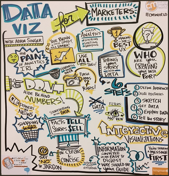
My favorite part is the lizard that represents your limbic brain. Visuals cut straight to that reflexive part of your brain, making a point quicker than listing facts and drawing conclusions.
Here’s how Adam suggests creating data-based visuals that speak directly to our inner lizards.
#1: Prepare Data for Analysis
Great data visualization starts with…well…data. More than that, it starts with a meaningful and manageable data set. The data you choose to include should be tailored to both the story you want to tell and the audience that’s going to receive it. For an example, when pulling internal data, your CEO might just want to know whether marketing is contributing to revenue. By contrast, your CMO will want revenue, engagement, and sales enablement data.
Adam recommends these three steps for data analysis:
- Filtering: Make sure you’re getting high quality data. For example, in your website analytics, exclude bot and spam traffic from your traffic reports.
- Sorting: Use the sorting that makes the most business sense. In most cases, a combined and weighted sort will be the most useful, organizing data along two variables.
- Grouping: In Google Analytics, you can group data into categories. This can help you create more specific, focused visualizations.
#2: Tell Your Data Story
With the data in hand, you can create a visualization. Aim to create an image so simple, specific, and clean that it’s readable at a glance. In other words, the opposite of this: 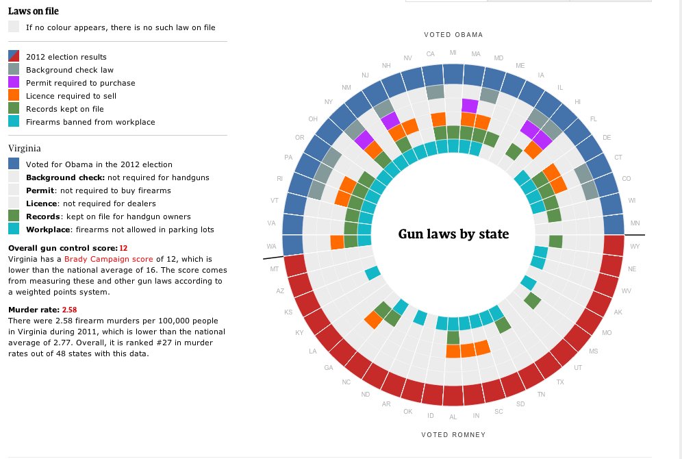
Notice how your eyes flick back and forth between the legend and the chart, trying to make sense of it all. Compare that chart to this one:
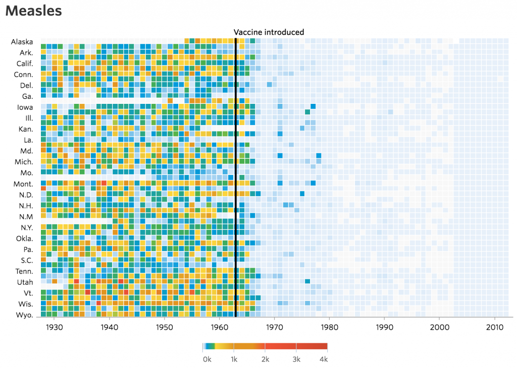
There’s a mountain of data behind that visualization, but you can instantly grasp the point: vaccines eliminate diseases.
Such a stunning visual doesn’t happen by accident. It takes careful planning. Adam recommends “storyboarding” your visualizations before you even pull the data in. Nail down who you’re talking to, what questions you’re answering, and the story you’re telling before you create a single chart.
#3: Best Practices for Compelling Data Reporting
As with any kind of storytelling, the best way to visualize your data depends on your audience and your story. But there are some consistent best practices to follow. Adam recommends following these guidelines for visualizations in your internal reporting, regardless of audience or intent:
- Keep charts and graphs simple. Don’t graph every data point–just enough to show the trend. Focus on what matters most to your story.
- Tell the user what the point is. Your audience shouldn’t have to guess at the conclusion you want them to draw: Put it right in the title of your visualization.
- Don’t spin the data. Ever. The point of data visualization is to get at the facts, not obscure them. Don’t abuse your audience’s trust with misleading visuals.
- Make reporting part of your process. It’s easy to think of reporting as something tacked on to the end of a campaign, a final housekeeping task. Better to see reporting as vital to our ongoing marketing efforts and approach it with dedication and enthusiasm.
- Use the right data for the right stakeholder. Make sure you personalize your reports for different audiences, sticking with only the most relevant data for each.
- Be creative and have fun. Solutions like Google Data Studio make it easy to pull in data and play with visualizations. Don’t be afraid to experiment!
A Picture Is Worth a Thousand Data Points
When done properly, a single chart or graph can convey paragraphs of information at a single glance. Choose your data carefully, keep your visualizations simple and purposeful, and you can create a report far more compelling than a list of stats and figures could ever be.
Speaking of beautiful data visualization, have you seen our interactive influencer marketing infographic?


