Layout 2
Our emphasis on TopRank’s Online Marketing Blog has meant less attention to our company web site. However, as much of an asset the blog is, we simply could not go on any longer with a company web site designed by a non-designer (me) six years ago. I’m surprised more people have not made fun of how bad our current site is.
After careful consideration of our company goals, objectives, messaging and target audience, we’ve finally initiated a new site for TopRank Online Marketing. This site not only presents a new design, but an up to date perspective on TopRank’s holistic approach to marketing online combining SEO, paid search, social media, email marketing and social media. Other content and features include: videos, a small number of podcasts, a blog powered media room, articles, site search, email newsletter, white papers and case studies as well a significantly improved site architecture for improved user and search engine interaction.
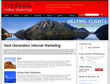
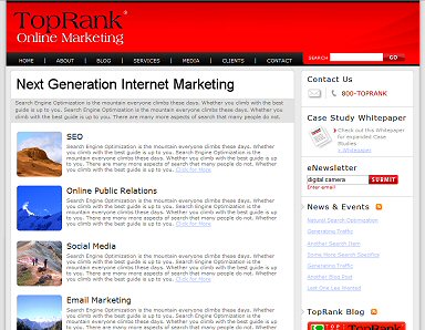
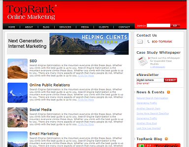
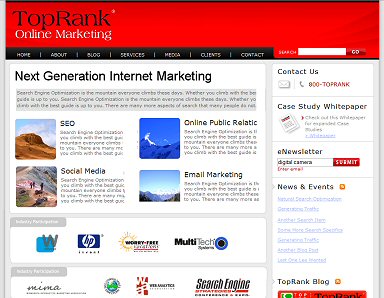
Designs are being finalized, but I wanted to share a few screen shots of different home page layouts to give OMB readers a glimpse of what the new site might look like. The one change that will occur is how the logo appears in the header since red on black can be difficult to see. I sized the thumbnails myself instead of having Max do it, so forgive the image quality. Text is all placeholder as well.
Layout 1
Layout 3
Layout 4
If one of these layouts stands out to you, feel free to provide your feedback. While we’re undergoing our own usability testing process, I would be curious what OMB readers think as well.
Lee it’s hard to tell with just the screen shot since I would like to be able to use the site to decide, but from what I see I like Layout 1.
The image in Layout 2 is nice, but it doesn’t really add anything for me. It just keeps me from getting to the content for a moment or two. I don’t care as much for the same image in Layout 2. It works better for me in the larger version.
Layout 4 works fine for me as well. I can see the 4 sections working for a home page, but I think interior pages would work better with everything grouped into one column since it feels less cluttered.
They all look good and I’ll be looking forward to showing up one day and see which one you decided to go with.
Thanks for the feedback Steven!
I really liked layout 2 first. With the large picture, the motto (I assume) front and center. I also like the Layout 4 with the 4 sections right there… no scrolling involved. (I can see more information at once)
I like the new design Lee. Looks like you guys have a nice color scheme and theme going. I like that you’re keeping it consistent with the current blog theme.
Could just be the screenshot, but that redish header with the block logo text looks hard to read and too dark. I would consider making the “Top Rank” text white and your “Online Marketing” text black. That, or some kind of white border around the black font for some separation. Just a thought.
Let me “TopRank” them…
1. Layout #4 – We are conditioned to trust brands and trademarked logos. By showcasing a few well known clients and your organizations, it brings more credibility and gravitas to an already credible organization.
2. Layout #2 – It was tough for me to rank this one second–the photo and and slogan elicit a powerful emotional response that the visitor ties to the TopRank brand.
3. Layout #3 – Again, I like the main image.
4. Layout #4 – Still very sharp but one of them had to be ranked at the bottom.
Looks great, Lee!
Lee … my vote is for Layout 4.
It seems that Layout 4 covers more ground without boring the visitor. Quick explanation of the services and if they want to learn more they’ll simply click on any of the 4 services available.
Layout 4 also looks cleaner and more professional.
Above the 4 service sections I like that 3 line text area. There you can be “Frank” with your visitor and kind of give a quick personal message to the visitor. Try to create a persona within those 3 lines.
Overall I think you’re on the right paths.
Good luck Lee.
Definitely no.4
If you dont use it please sell it to me 😛
Lee – why not use Bix for this?
http://bix.yahoo.com
I can create it for you if you like.
Michael
Hi Michael, when we get it narrowed down to two, I might just do that. Thanks for the offer!
it actually might be easier to do it now. The algorithm isn’t effective with just two entries, since it’s a face-off system.
You can embed the widget directly on your blog for voting.
Just a thought.
I like 1 a lot.
The colors seem to flow better.
I also wonder, are you going to include any new video functions? I would suggest you check out:
http://www.bubbleguru[dot]com
Have a pretty neat vidoe platform for blogs.
Go for #4 Lee. You’ve got a few seconds to impress prospects and they’ve likely seen many sites that talk about how great their services are. Few sites will be able to match your client list and speaking engagements – that will help you stand out from the crowd.
That said, all look good.
Hey Tom, thanks for the comment. We do have videos included as part of the “below the fold” content on the home page.
BubbleGuru is an interesting service and we may test it on a landing page.
Thanks for the feedback Andy, much appreciated!!
Michael, I see. I’ll log in and see what I can get up there. The question is whether the widget plays nice with WordPress.
It plays really well…. Send me the contest url and I can drop into a really nice customized widget for you; and then I’ll send you the code.
I vote for layout #3. Speaking with a background in design, I think layout #3 offers a nice balance between graphics and text. Studies have shown that the average visitor prefers a site with a good balance between graphics & text.The header image isn’t too dominant and there’s a nice flow from top to bottom. Another good feature – the visitor doesn’t have to scroll down to see the majority of contents – it’s in plain view.
Remember one thing. Its not about your site, but rather its about your users.
6 elements that should be on every page of your site are Site ID (logo), the sections, utilities (about us, sign in), a home button, a way to search and a sort of “you are here” indicator on the page.
Lee – drop this into a page. You can change the height and width. Once you create the contest on Bix, replace the contest ID in the below code with your contest id.
Michael, I’m going to do an entirely new post for the Bix voting. Thanks for your help!
I like 2 and 4. The big image at the top is very nice. While yes, it drops the text down a bit, this seems to be more and more common in designs. Some usability testing on that would be worthwhile. On 4 I like the way the services are in two columns rather than one. Do a combo of both and I think you have a winner.
Hey Stoney, that’s exactly what I’m going to be talking to Max about today! Thanks for your feedback.
Hey Lee, good idea to put these up for the viewers to decide.
My initial response is layout 4 is the winner.
Layout 2 is nice but that big image says nothing about your company. Its unnecessary fluff that takes up space “above the fold” and takes time to load. Both of which aren’t positives for blogs.
Layout 1 is nice but I think since its all vertical your not taking advantage of that real estate in the best way. It feels more like a sub page vs a home page.
Layout 3 is good but once again it feels like a fancy sub page vs a home page. Also, the images you choose are vital. I wouldn’t use any image that didn’t strongly convey what point your trying to drive home.
That leads me to Layout 4. By far the strongest version.
No extreme unnecessary images…as long as their small you can probably get away with them. But the larger they are the more real estate they take up.
A few suggestions, if you don’t mind.
I might try for a bit more contrast. The white and grey is very clean but everything on the page appears to have the same value, visually. My eyes are drawn to the images in the center of the page but they move up to the darker grey box right below the main tagline before I really digest what the images are. If you make that grey box a bit more saturated you can drive home a very powerful message thats in that box.
The extremely vibrant red startles me bit. Red evokes very strong emotions and mixed with the black, makes things visually unsettling. On your current design you use a darker red that isn’t so “in your face”.
Now it may just be that it’s hard to see the thumbnail, but if you want to make the Best Blogs list you’ll need to incorporate an RSS icon higher up on the page. hahah.
Hey Lee,
I really like layout #2 the best. I think it has the most eye catching appeal. The image is fantastic and the red header really grabs your eye. Of all of them, this layout looks the cleanest to me. It does push some of the information below the fold, but you have your navigation at the top, so I don’t feel that this is a huge issue. It will definitely need to go through some testing though, to see what really will work for you and the company!
My 2cents
keep the small orange text on the top of #2
Use the smaller image of #3 – I like ‘helping clients’ slightly off center and high on page
the four squared topic areas on #4- all critical info above the fold 🙂
I like layout 4! it has a good mix of content, picture n everything…
Hey Lee,
All of them are nice. However, without a doubt, #1 stands out to me from the rest due to the emotional appeal and branding.
Sure, businesses will come to seek out what you do by the search engines, but setting the stage with the image and position statement of “We help clients climb higher” tells a potential prospect exactly what you do within 2 seconds without a lot a verbiage. The only thing i might add is your trust builders above the fold like you do in some of the other designs.
Anyways, that’s my 4 cents, because the first 2 are free:)
Christian
Hi, I’m new to the blog, having seen your title in my RSS feeder, and I thought I’d stop by and make a comment…
I like Layout #1 and #4 — #1 for the image that grabs one’s attention right away.
Perhaps this image could be in the header, to the right of the blog name. And the mantra ‘Helping Clients…’ could be right underneath.
The red is too glaring and, with all that space next to your blog name, it’s just too hard on the eyes.
Layout #4: I like the 4 sections together that are easy to scan at a glance.
I’d like to add a suggestion re: if you want more people to vote on your site design; perhaps offer your blog services to someone who gets randomly picked from those who put in a comment? Or, to the person who sends the most people to your blog to vote?
Yvonne