UPDATE: Google has announced the official rollout of the new design on Google Blog.
Google is a master of innovation in the search space and while they seem to subscribe to Guy Kawasaki’s “release early and release often” new product philosophy, the attention to changing the Google search page is near-holy. Minuscule design changes at even the pixel level are cautious and carefully considered. And rare.
Apparently, Google is testing a redesign and logo which you can see in this home page screen shot:

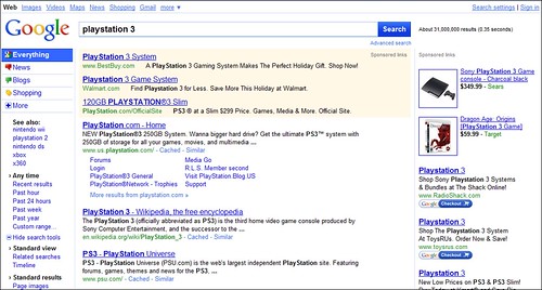
The logo has changed and the “Google Search” and “I’m Feeling Lucky” buttons are blue rather than gray. But the biggest changes are on the search results page. There are three columns rather than two:
I’ll mention some of the specific changes but I have to say, my initial (and critical) opinion of the updated search results page is “awesome”. I liked it immediately.
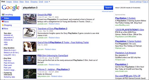
Left Column: Colorful blue headings and icons are added for categories of search. The number of initial categories displayed varies by the search query. When I searched on “playstation 3”, Everything, News, Blogs and Shopping showed as the default search categories. You can expand categories to include images, video, books, maps and forums. What initially displays and the remaining categories to expand varies by the query.
Related search queries are listed below that followed by options for time intervals which are from the Options feature.
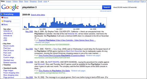
Additional search tools can be expanded including even more related searches and a timeline. I did a vanity search for my name and the timeline went back to 1960!
Standard search are displayed as a default, but under expanded search tools options for Page images, Fewer shopping sites, More shopping sites and Page previews are available.
Middle Column. The search results for news, blogs, images, video etc all stay within the same format as standard search, although shopping is unique. There is a preview page image search option that is pretty handy, allowing you to see a thumbnail of the page.
I did notice related queries suggested at the top of the page on some queries, but not all. Normally, related queries are displayed at the bottom of the search results page.
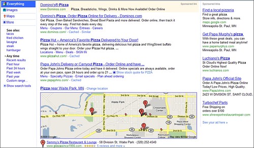
Search queries for items that invoke local search results like “pizza” display best match web sites on the top consistently in my tests and the map displayed in the local listings is much wider than it is now.
Right Column. I didn’t really notice major changes in the sponsored links. Recent changes in the right column have included movement left, closer to the organic search results as well as the inclusion of images in the sponsored listings vs all text.
What does this mean for SEO? For Social Media Marketing? With the efforts to disambiguate search results by offering search category filters, it makes sense for content publishers and therefore, website marketers to ensure Digital Asset Optimization efforts are in effect. By showing the time sensitive search options all the time, it will bring more attention to fresh content.
I think core strategies that are focused towards creative content creation and promotion in multiple media formats will do well in a new Google. Besides the aesthetic changes shown above, I noticed several instances of Google indexing and ranking images for text displayed within the image when that text did not appear elsewhere. It could have been due to anchor text of incoming links, but I think it’s worth watching.
Along those lines, I suspect with YouTube’s automatic captioning feature that uses speech recognition software to convert the audio of a video into text, that even more implications will be seen for rich media in the search engine optimization space.
As far as I can tell, this new Google design was reported on Google Blogscoped yesterday where you can get the copy/paste code to check out the redesigned Google yourself. SEL also mentioned it and I would expect that if this is indeed a new change Google will make permanently, that Danny Sullivan will provide a comprehensive analysis and info direct from Google.


