 It’s safe to say that Big Data is revolutionizing 21st century business. The big question for marketers, however, is how do you take the wealth of information at your disposal and effectively simplify and present it in an engaging and informative way? One answer is infographics.
Defining what entails a good infographic is complex. For one, not all data lends itself to creative and unique visual communication. Someone who’s expert in design may not understand your audience or how to map relevant data in a compelling way. Don’t forget: great content isn’t great until it’s discovered, consumed and shared.
A couple of years ago, big splashy infographics with little substance were able to attract a lot of traffic because they represented a new content marketing format. While the novelty of the format has waned, they are still a fantastic way to present ideas and data in an easily digestible way as long as you think about the story behind the numbers and readers glean actual insight.
Remember, data is the foundation of every infographic, so when you have a dataset on hand, take the time to learn what it’s about, where it’s from, the methodology behind the estimates and what makes it interesting and unique.
According to statistics gathered by Hubspot, consider that
- 90% of information transmitted to the brain is visual
- Visuals are processed 60,000X faster in the brain than text
- 40% of people will respond better to visual information than plain text
So, the proliferation of infographics should come as no surprise.
When it comes to business, big data offers unprecedented insight, improved decision-making and untapped sources of revenue. In the era of big data, where information moves faster than ever, infographics can reveal patterns in our lives and our world in fresh and surprising ways.
Simply put, infographics as a content marketing tactic provide a tool to educate and inform your primary target audience using data-rich visualization through storytelling, which TopRank has advocated for years.
Pros
- Helps with search engine optimization (SEO) – As the infographic gains traction, it earns incoming links.
- Builds brand awareness – By adding an unobtrusive logo in a prime position on the graphic, you can boost your online branding. One way to measure this is by viewing image file loads in your server logs.
- Creates social buzz – It’s easy to measure new followers, fans and sharing on various social networks.
- Establish company as an industry thought leader – By utilizing your own company data, internal subject matter experts, and industry related research, you offer a rich trove of information, demonstrating your expertise.
Cons
- Infographics created solely for their ‘linkbait’ potential has resulted in a glut of poorly executed infographics, giving a bad name to worthy and creditable data visualization.
- The cost to create a striking infographic may place this content marketing tactic out of reach for small businesses.
- Outsourcing information mining for statistics or hard data may result in a disconnect with your audience’s true pain points to be effective.
- Unrealistic expectations of what it takes to make an infographic ‘go viral’ could perpetuate infographic fatigue, doing more harm than good for your brand.
What the Experts Are Saying
“As a Google search term, ‘infographic’ has increased nearly twenty-fold in the last five years. Yet infographics have been popular, in one form or another, for centuries. The source of their power isn’t computers or the Internet, but the brain’s natural visual intelligence. Gareth Cook, The New Yorker
“The very best [infographics] engender and facilitate an insight by visual means — allow us to grasp some relationship quickly and easily that otherwise would take many pages and illustrations and tables to convey. Insight seems to happen most often when data sets are crossed in the design of the piece — when we can quickly see the effects on something over time, for example, or view how factors like income, race, geography, or diet might affect other data. When that happens, there’s an instant ‘Aha!’…”David Byren, quoted in BrainPickings.
Infographics That Engage
National Pen Company
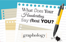 Ranked #2 for views and shares on Visual.ly, the National Pen Company created a compelling information-packed infographic geared to their target audience. Who knew so many people still wrote with pens?! They identified over 5,000 personality traits that are reveled when a person writes. With their in-depth data analysis, they tapped into the zeitgeist of handwriting analysis. They intrigued the reader with tidbits of how graphology is even used for detecting lies. In addition to being visually appealing, they cited numerous credible sources in the footer of the graphic. You can view the entire graphic here.
Dell – (TopRank Client)
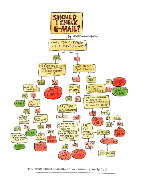
Dell, clever as ever, utilized the old-school binary ‘yes-no’ format known to programmers the world over to engage their primary audience. They created a cohesive piece of ‘eye candy’ incorporating humor which, again, works with tech types. While there’s no real data employed, by visualizing a ‘Day in the Life’ of a person sitting in front of a computer all day, Dell made it clear they empathize, making it easy for the reader to connect with the brand.
ADT Home Security Services
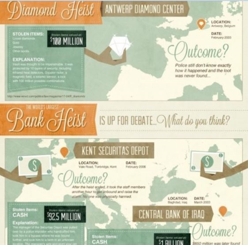
The creative department at ADT Home Security Services produced this infographic, depicting some of the largest diamond, cash and art-related crimes around the world in recent times.Making use of thorough research, the infographic’s author establishes what are generally believed to be the top heists in all three categories, and writes up notes showcasing just why each is classified as ‘extreme.’
The infographic does a good job of incorporating a clean central theme, blending in the different heist scenarios into a single canvas. The recurring stylistic elements of the map background and the ‘outcome’ section tie together the separate topics into the intended focus of the need for security without hitting the reader over the head.
Infographic Best Practices
- Write a catchy title. (Easier said than done.)
- Choose an interesting vs. ‘hot’ topic that resonates with your customers’ needs.
- Be topical. Check Google trends for trending topics relevant to your industry and/or target audience.
- Involve credible sources in the data collection, such as prominent companies, people or research organizations, and then encourage those sources to help you promote the resulting graphic.
- Promote vial social channels and make it easy to share or embed by including HTML code.
- On the resized image page, try and insert text to help with search engine crawlers and include social sharing buttons above and below the infographic.
- Avoid a white background or too much text. Infographics are often shared on multiple websites and blogs, most of which have white backgrounds. If your infographic’s background is also white, then deciphering where it begins and ends will be difficult.
- Link to a larger image of the graphic to a page with no formatting for a better user experience.
- List references of research sources you’ve cited, which will increase the perceived value of your efforts.
For more on the optimization and marketing of infographics, see Chapter 10, pp. 142 – 144, Optimize, by Lee Odden.
Remember, you’re telling a story. Too much emphasis on data points (less is better) and not enough on high resolution visuals will result in a ho-hum infographic that receives a tepid response. Design isn’t just about making things pretty. It’s about making things work and, in the case of infographics, that means representing data accurately and clearly. It means letting the data speak.
What do you envision the next generation of infographics will be?
Photo credit: Shutterstock


