

Internet users are spending more time than ever on their smartphones, which means Content Marketers must adjust their strategies to create a better user experience for those drawn to the small screen.
The release of Google’s new mobile-friendly update, aka “mobilegeddon”, has drawn a firestorm of attention to the need for improving website responsiveness and user experience on mobile devices.
There’s a good reason for this: A recent study by ComScore and Millennial Media found that approximately 56% of digital content is now consumed via smartphones. Knowing that a large portion of your audience likely searches, consumes and interacts with content on their mobile device should inform how you execute on your Content Marketing initiatives.
The good news is, despite the apocalyptic headlines on many blogs, Google has stated that the new mobile-friendly update only affects:
- Search rankings on mobile devices
- Rankings of individual pages, not entire websites
Even so, mobile content discovery and consumption is universal and it’s more important than ever to optimize for search and user experience with content on all devices. To help you save the day, we’ve compiled a list of 4 essential tips for content marketers to take a more mobile-friendly approach to content. Make Google happy. Make your customers happy. Everybody wins!
#1 – Understand Where You Are Now
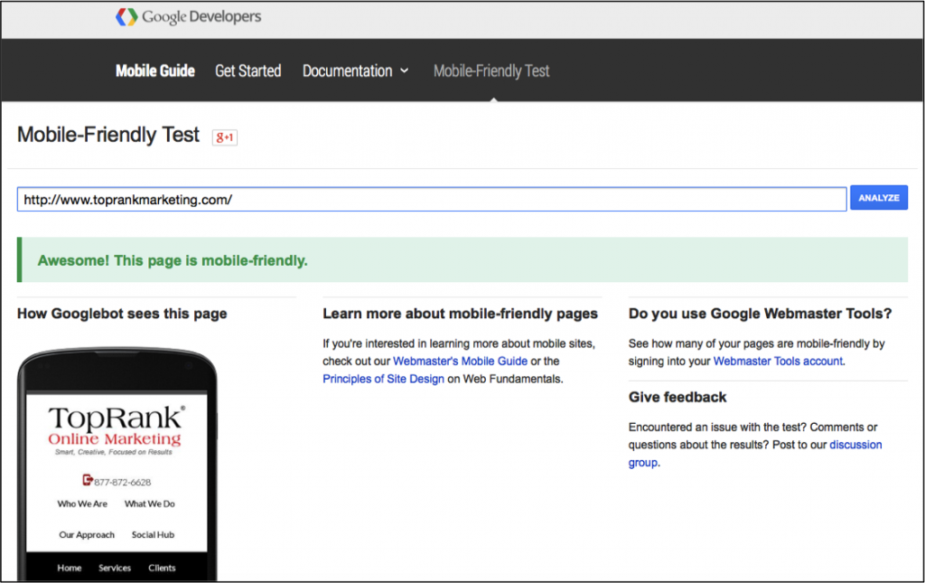
Google has provided a very handly (albeit not 100% accurate) tool that can be used to quickly check to see if any website is mobile friendly. If you pass the test you’ll be shown a snippet of how Googlebot see your page as well as some additional resources on creating mobile-friendly web pages.
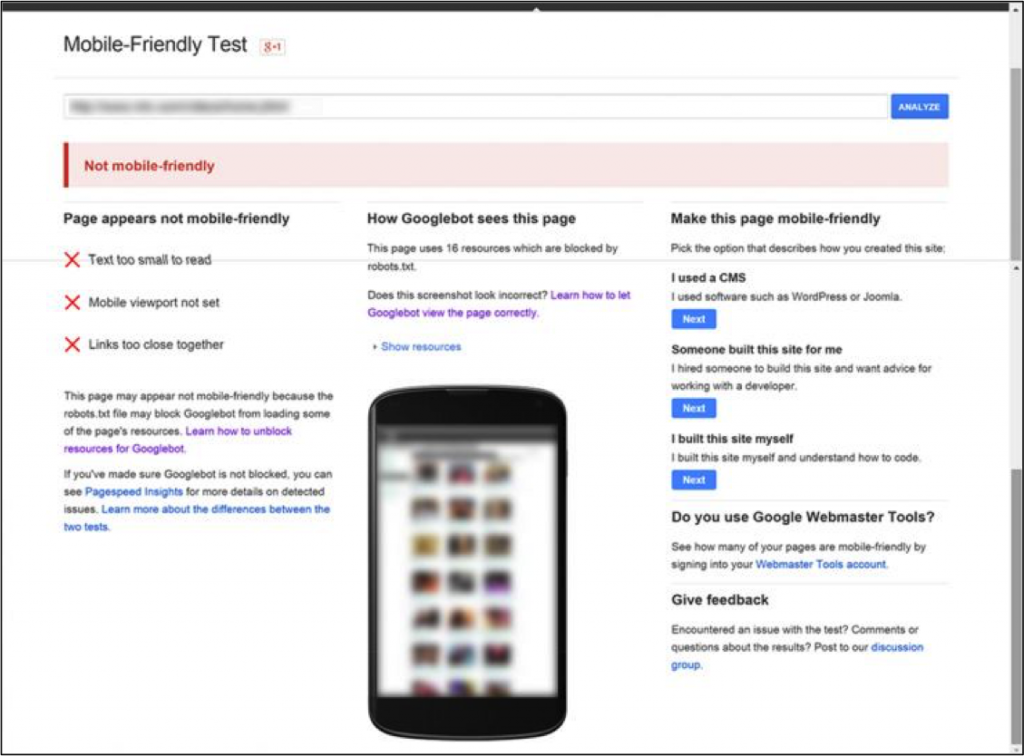
If your website fails the test, Google will provide reasoning for the failure as well as recommended steps for making the website mobile-friendly. Below is an example from Moz of a website that unfortunately did not pass the mobile-friendly test. In fact, this blog did not pass the test until recently, thanks to the efforts of Evan and Howie on our team to update our WordPress template.
The third way you can assess if a website is mobile-friendly is by simply typing a query in your smartphone on Google. If the website is mobile-friendly it will be indicated just prior to the web page meta description.

#2 – Always Keep Your Audience in Mind
Google doesn’t make purchasing decisions, your customers do. So while it’s important to follow the guidelines that Google sets forth, your customers should always be top of mind when determining your Content Marketing strategy.
Rely on your data and what you know about your audience to help form the changes you will make to content in order to meet Google’s new mobile-friendly requirements.
#3 – Make Your Headlines Notable
Between smartphone apps, email and mobile web content, consumers are constantly inundated with digital content on their mobile devices. This means your window of opportunity to grab and hold their attention is very small. When crafting your content headlines, focus on:
- Offering a teaser of the content to draw them in
- Clearly articulating what they’ll find
- Empathizing with their needs and pain points
#4 – Create Concise Content That is Easy to Consume
How your audience consumes and interacts with your website content on a mobile device can be much different than your desktop users. Keep in mind that your website must serve both mobile and desktop users in a way that is relevant. How can you make your website experience more meaningful for mobile users?
- Website Home Page: Offer brief overviews and appropriate Calls to Action for the various focal points of your website.
- Website Interior Pages: Provide a concise overview at the top of the page so that mobile users can quickly scan the content. As you move down the page you can dive deeper into your focus areas. This will ensure that both mobile and desktop users have access to the proper amount of content.
- Blog Content: Focus your introduction on providing an overview of what they will find in the post. Again, this will allow your audience to determine if they want to consume the information on-the-go.
Google’s new mobile-friendly update shouldn’t be seen as an Armageddon-esque threat, but as an opportunity to better serve your online audience with content that is easy to find, consume and act on with mobile devices.
Hopefully the tips provided above take some of the fear, uncertainty and doubt out of the process and have provided a clearer path for making your content marketing efforts more mobile-friendly.
I am curious to know; What type of content does your mobile audience typically respond best to?
Photo: Shutterstock


